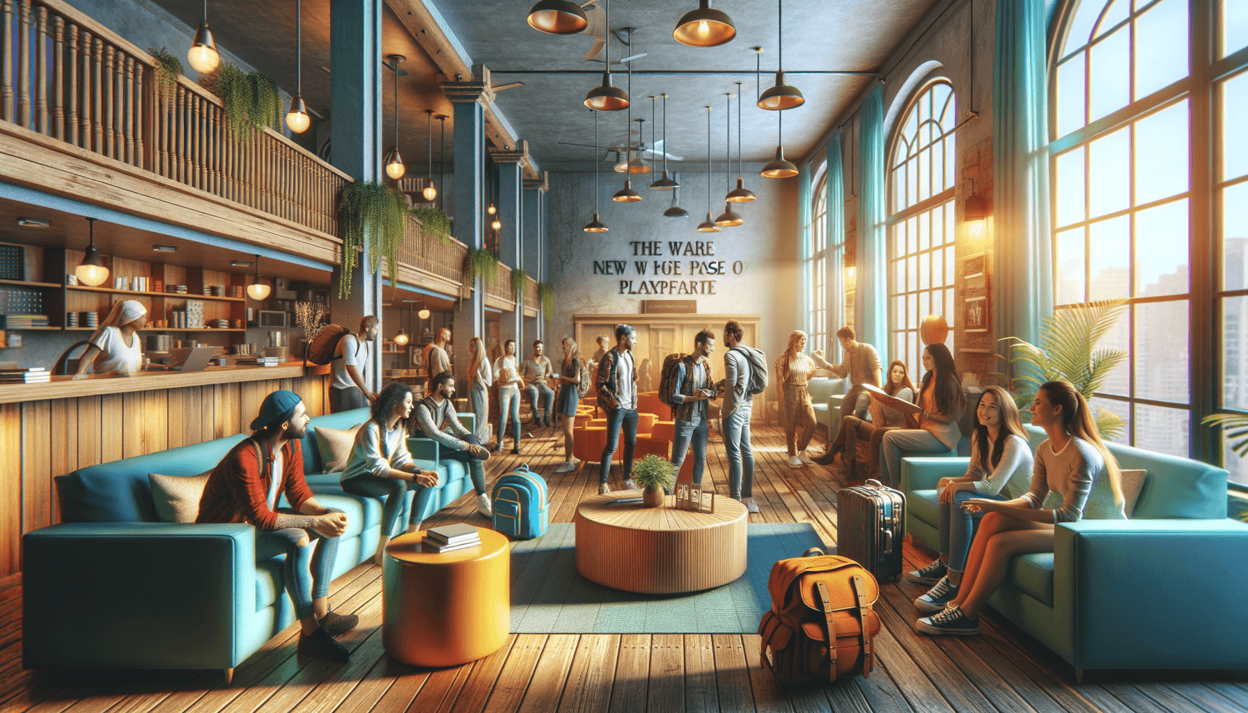
It has been in the making for quite some time, and Hostelworld's desktop face-lift has finally been rolled out, and we're impressed! On top of all that, they even launched a new logo in orange, which is increasingly becoming the new color of online travel (Kayak.com, Viator.com, Hostelclub.com, GetYourGuide.com, Airbnb.com, and more). In fact, we even chose orange for our logo color, following Wix's guide that describes it as "energetic" and "vibrant."
On top of the layout, they have significantly improved their filtering ability with Kayak.com-style filters that make it easy to narrow down your search options. We are happy to see these improvements. The new site is visually appealing and simpler in terms of user experience. This is a great starting point for Hostelworld's new branding, and we cannot wait to see where they will go next. From here, they can use analytics to see what users are doing, come up with some change ideas, and A/B test themselves into improving the experience, with conversion being their main focus.
If they need some functionality to A/B test, here is a list we came up with:
Something a little more scalable (perhaps use the Bootstrap grid)
(Along with scalability) Try removing the top navigation bar and placing it into a hamburger menu, especially on smaller screens
A customer service link at the top
A larger map to work from
